Strong Museum Wayfinding
Here's a tip — click a piece to get a full view of it!
Adobe Illustrator, Photoshop, InDesign, TinkerCAD
For this project, I chose a place local to my home city and created a new wayfinding system for it. My chosen location was the Strong National Museum of Play, which is a very unique museum containing dozens of interactive exhibits focusing on play of various types. It's a very vibrant place that uses senses, light/color, geometry, and scale to create a very engaging and memorable experience for its guests, and I wanted this new wayfinding system to capture that essence.
The full proposal presentation showing my final designs can be found here, and my process is detailed below.
Process
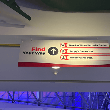
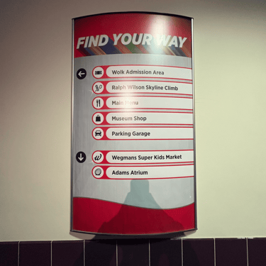
The first step after choosing the Strong as my location was to go there in-person and get a better understanding of the layout and take many photos of possible wayfinding spots. I had gone here many times as a child, so it was interesting to come back and experience it from a new perspective. These are some of the photos I took of the current wayfinding they have in the four spots I ended up choosing, but in total I ended up taking 93 photos of possible wayfinding locations.
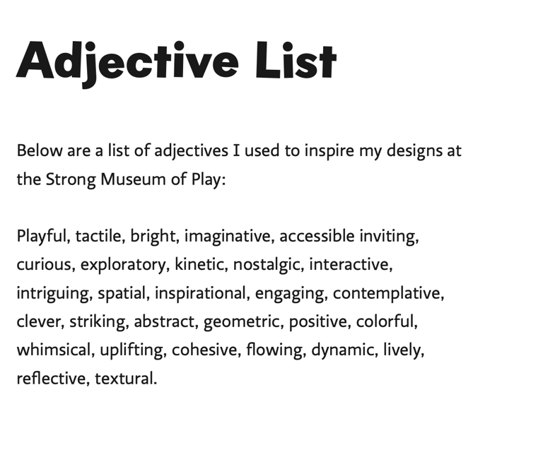
The museum's target audience is families, and especially the children in those families. With this in mind, I created a word list to better inform my design choices later on in the process, such as which color and type I would be using.
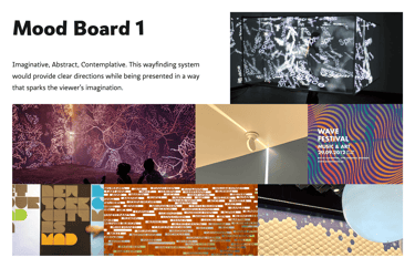
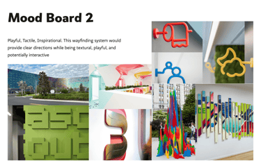
I also created moodboards referencing a few of these words, each representing a distinct possible direction I could take with this new wayfinding system. These can be seen below.
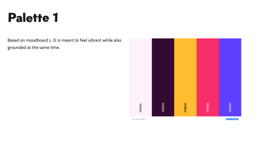
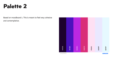
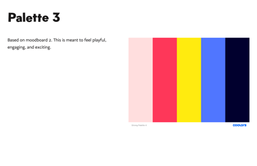
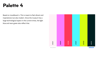
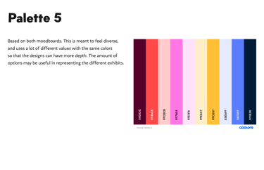
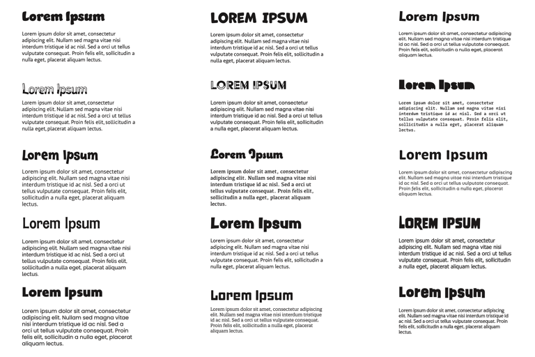
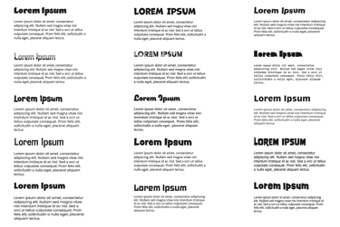
Using my moodboards and word list, I then conducted a type study and generated various color palettes to have typorgraphical and color ideas to narrow down later on. The thinking behind each color palette can be seen by clicking on one of the tiles.
The full process document can be viewed here, but below will also be a walkthrough and further explanation of the entire process of this project.
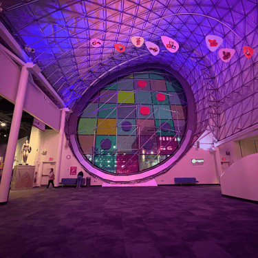
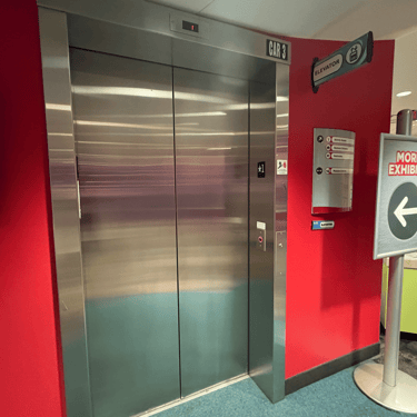
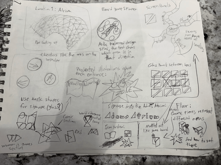
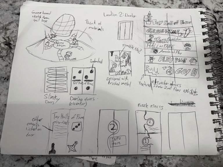
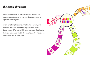
I also came up with some sketches for possible graphical elements and concepts I could use for the locations I chose. The first page shows ideas for the Adams Atrium section of the museum, and the second page shows concepts for the nearby elevator leading to the National Toy Hall of Fame and other exhibits accessible through it.
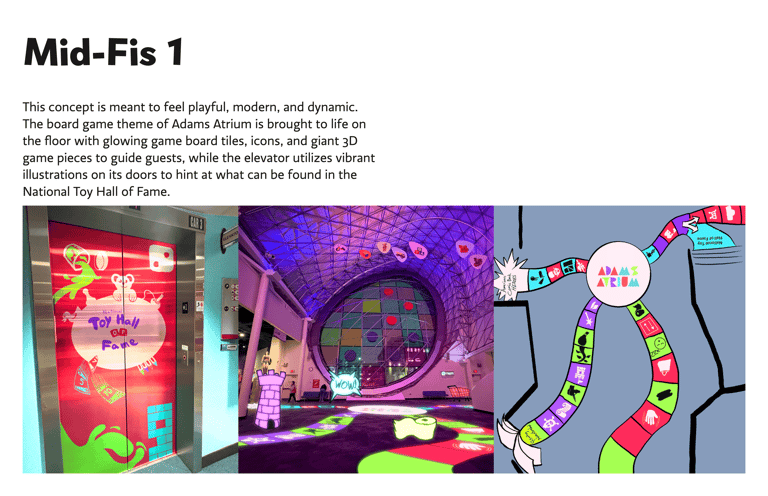
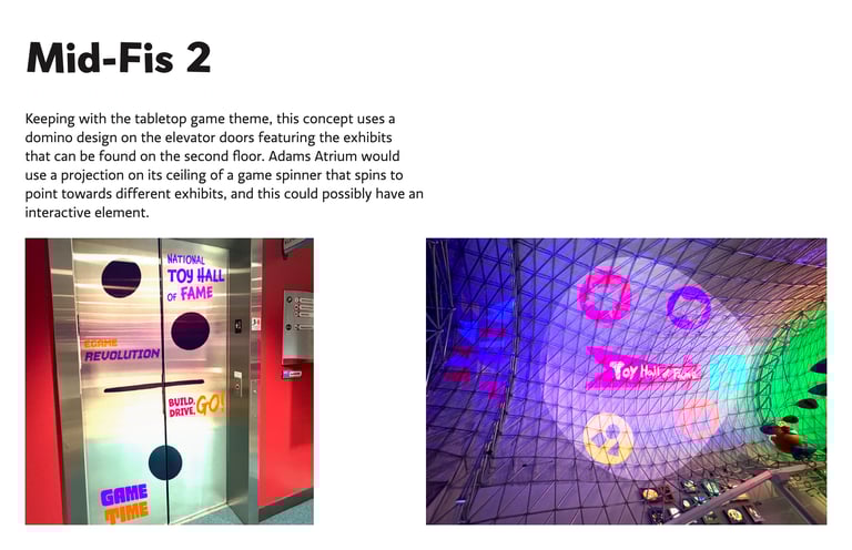
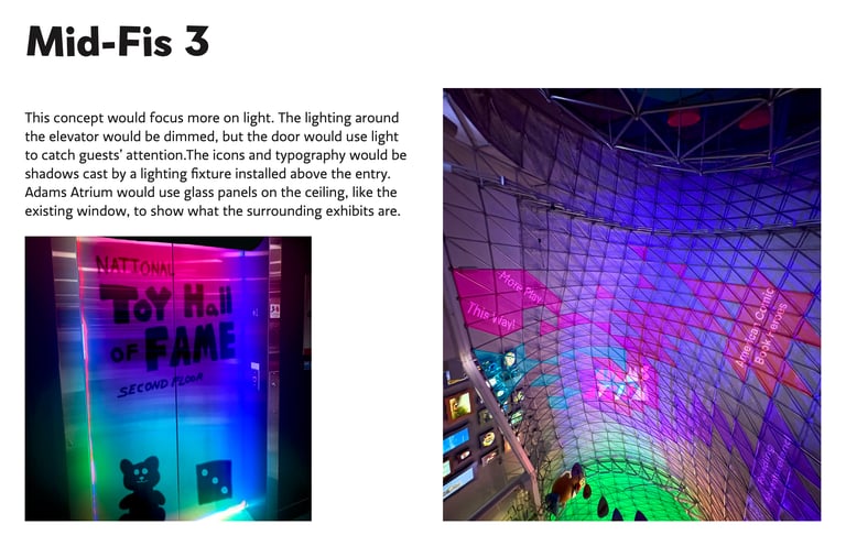
After sketching, I illustrated some mid-fidelity designs over the photos I took. Below the sketches are each of my mid-fidelity mockups, showing 3 different concepts I could move forward with.
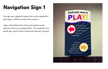
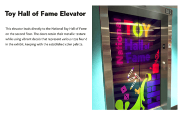
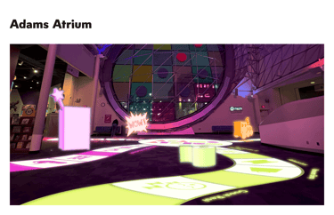
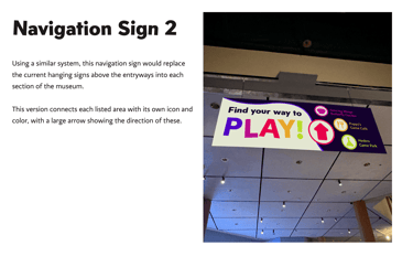

The final design solutions are shown here, and each image can be clicked on for a more detailed explanation. My sources are also listed.
This system aims to turn wayfinding itself into the adventurous, otherworldy experience provided by many exhibits at the Strong Museum of Play. It uses vibrant but cohesive colors, 3D space, light, scale, and charming illustrations to make wayfinding easy and memorable.
If I were to expand on or refine this project, I would've thought of more creative concepts (light, material, etc) to use for the two navigational signs. I also would have worked on refining some of the illustrations and typography, particularly within Adams Atrium.