

Art Movement Letter Cards
Adobe Illustrator, 3" x 4"
These cards show a letterform designed to reflect an art movement. Both letters and movements were chosen at random — lowercase "o" and capital "N", and Art Deco and Minimalism respectively. A third card was added, showing one of the letterforms composed on a designed background.
It was necessary extensive research on both of these movements; their history, the visual traits that make them unique, the artists involved, and the culture surrounding them. I also had to use a limited color palette from an already limited variety of colors.
The first and most important step of the project was researching both art movements. Without understanding their history and their traits, it would be difficult to accurately represent them. I used a variety of both physical and digital sources such as books, websites, articles, and photographs, and combined these into the PDF to the left to document my findings and reference later on.
Art Movement Research
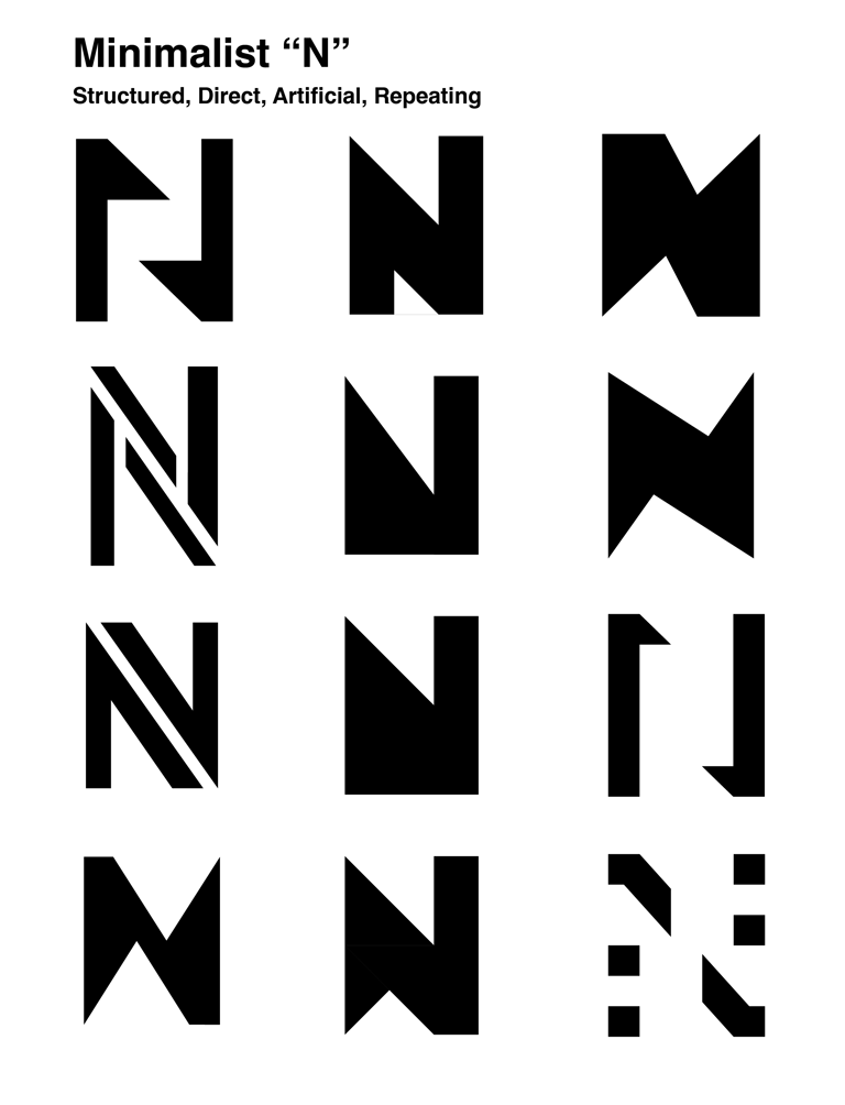
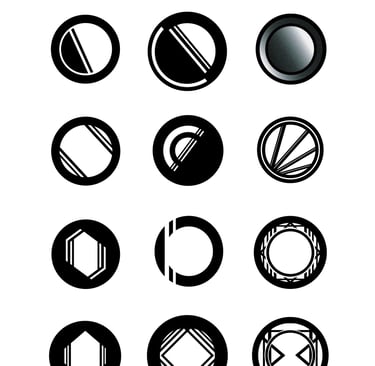
Once I completed my research, I started designing possible ideas for each letter. The N in particular was difficult for me to design, because I tended to make it too complex for the intended minimalism style.
Sketches
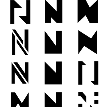
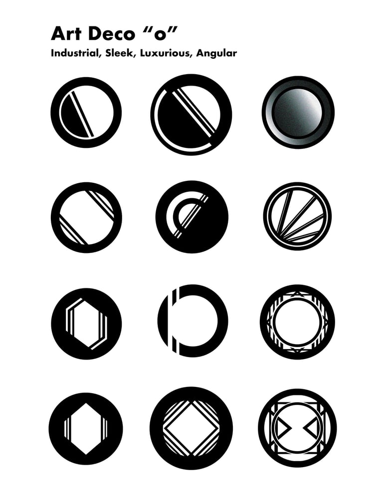
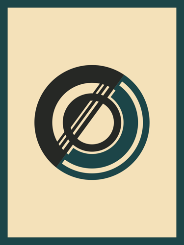
After settling on a direction for both letters, I started to create black and white compositions for their cards. While two of the cards had to be placed on a simple background, we were given the opportunity to use one of the letterforms and create a designed background for it.
These designs show possible designed backgrounds for both cards. The design for the N is inspired by the simple, geometric forms often found in minimalist art. Since a lot of minimalist art is sculpture, I tried to add depth to the shapes and the N. Despite this, I felt that adding design of any kind to a minimalist design takes away from its minimalism, so I decided that the art deco card would instead use a designed background.
Rough Card Compositions
After the final designs were completed, we had to put them onto a template that could then be cut to make 10 cards each that we could share with our peers. This meant that we had to add a bleed to the cards as well, to ensure that the color made it all the way to the edges of the cards.
Final Designs — Template
The final design for the minimalist N card is, as intended, very minimalist. In its own way, it was surprisingly more challenging than the design for the art deco card, because it required restraint to effectively replicate the minimalist style. This meant reducing the letter to only necessary parts, and choosing colors that reflect the simplicity of minimalist work; a white background and red, which among other primary colors is often seen in the minimalist movement.
The art deco "o" allowed me to take the design much further, which is why I chose it for the second variant with the design background. The design was heavily influenced by the sharp angles, repeated lines, and reflective, metallic imagery seen throughout the art deco movement. The colors — black, gold, and teal — also evoke the movement's sleek, elegant nature.
I think this project was successful because it effectively reflects the depicted art movements, and allowed me to overcome the challenge of not over-designing, mainly for the minimalist N card.
Final Designs
Dylan Lipp, 2025