Personal Mark
Here's a tip — click a piece to get a full view of it!
Adobe Illustrator
This logo was made for my personal brand as an artist, which will be featured in different places associated with my artwork. It went through a lengthy process over several months, and may change even far into the future.
Process
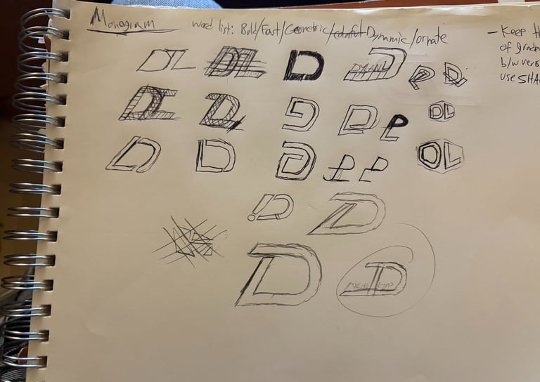
My first sketches can be seen here, along with a word list. I knew that I wanted to add a gradient of some kind, since they're integral to my work and reflect the wide variety of work I do. I wanted to use color to show this, but I thought that shape could also be used this way so that it still works in black and white. Combining the D+L of my first and last name is something I wanted to experiment with, but initially was having some difficulty combining them in an interesting way at this point in the process.
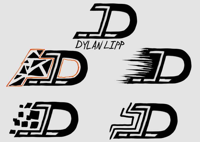
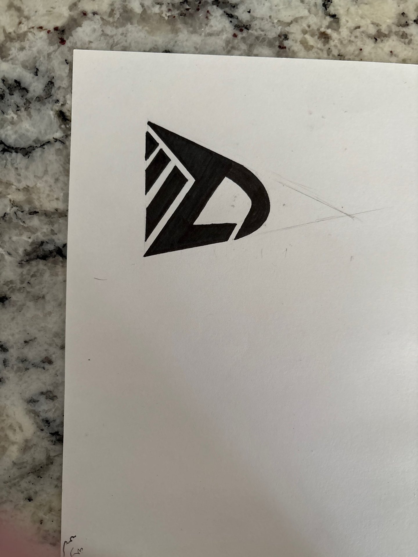
I tried moving forward with a concept that combined all of my initials, DJL. I thought that this concept could have variations of the logo that would be used to represent my different types of work. These ideas were ultimately too complex, and I would later realize that it was not a good idea to use a wider orientation for them.
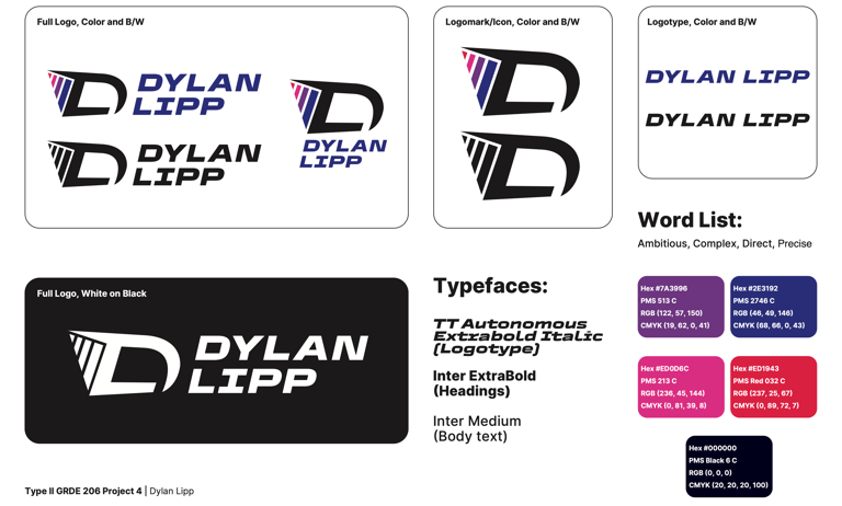
I then made the first "final" variant of my personal mark. I thought that this was a clever, contained way to combine my first and last initial, and the stroke of the D extending backward provides a more contained space to place my gradient element, and also relates to the theme of the word list. The colors chosen demonstrate a wide range, while also reflecting the sleek, vibrant, and bold nature of my work.
After some critique, I developed this modified version of the previous mark. I decided to keep the overall shape and type, but simplified the color bars in both number and color. I felt that this version, while easier to look at, did not reflect me or my work as well as the previous iteration of it did. I was also not completely satisfied with the overall shape or type choices carried over here.
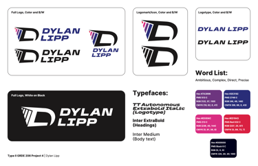
Later on, this sketch was made to try and solve some problems with the existing mark — it did not feel dynamic enough, was rather wide to fit within a profile picture or similar context, lost the identity that the colored version had, and possibly worst of all, my peers were reminded of "adidas" when looking at it. The latter wasn't solved in this sketch yet, but I was beginning to address other issues.
I developed this sketch further, and am overall satisfied with the current variant. The type feels more fitting and simpler than the previous type used for my name, the color has returned in a way that I think feels diverse but still simple, and the shaping of the color bars fits the shape of the mark better while addressing the "adidas" problem.