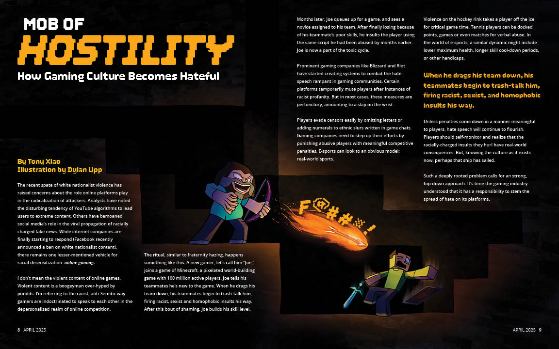
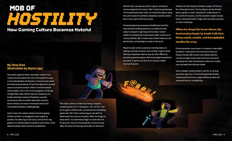
Editorial Spread
Here's a tip — click a piece to get a full view of it!
Adobe InDesign and Photoshop, Clip Studio Paint 16" x 10"
For this project, I chose an article from a student editorial contest by The New York times, and organized all of the text into a magazine spread, combining it with my own illustration. The original article by Tony Xiao can be read here:
https://www.nytimes.com/2019/06/06/learning/confronting-toxicity-in-gaming-going-beyond-mute.html
Process
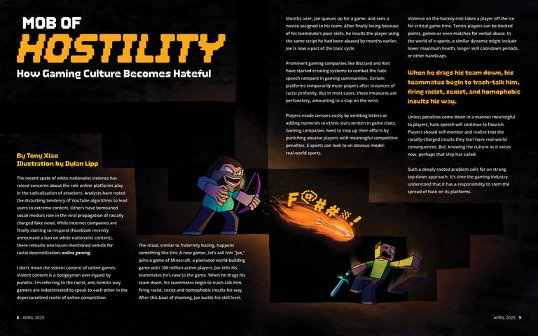
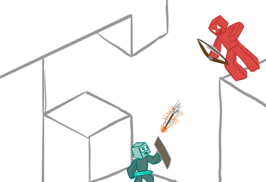
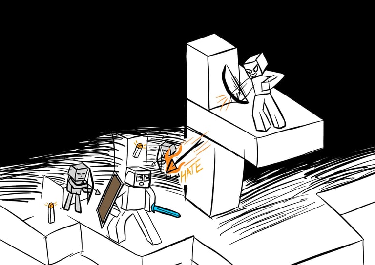
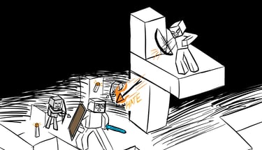
I began by coming up with imagery that could be used for the spread. The article discusses how online gaming culture has become very toxic, and specifically references the game Minecraft.
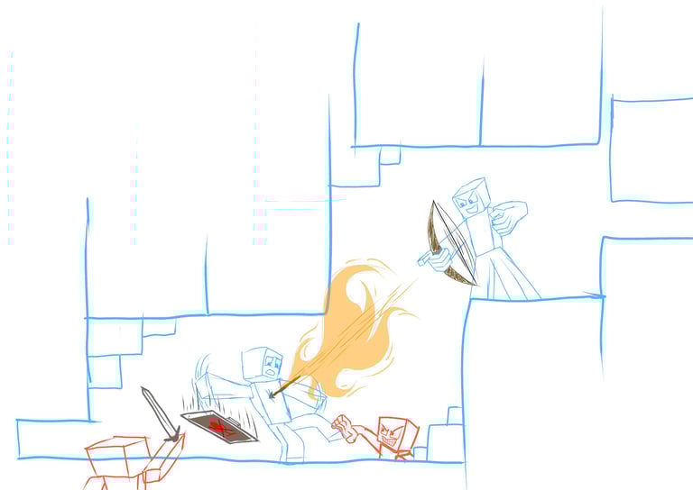
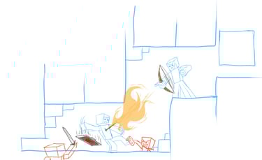
I wanted to create an illustration that referenced the game while also cleverly demonstrating the concepts discussed in the article, so the first think I did was create some very basic sketches that could fit all of the article content around the illustration (in a way that allowed for a natural reading flow), and the final drawing would be the last thing I did once the layout was decided.
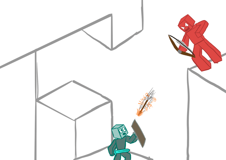
I also created some other layout concepts, with the gray shapes being reserved for illustration space. While the content of the article needed to remain the same (which made organizing the type in an easy-to-read way difficult), I had the freedom of changing the article's title. Some of my concepts used some other names I made.
This is the final layout of the body copy, which was challenging to finalize because several things had to simultaneously be true: the body copy needed to remain the exact same as it was in the article, the line length had to be brief enough to easily read through, have an overall clean rag, remove widows and orphans, and be broken into digestible paragraphs that flowed into one another. Block quotes were also added to break the space in an interesting way.
The final illustration uses some concepts from the other illustrations I made, in a more simplified but highly-rendered way. I believe the illustration as well as the type and color choices capture the essence of the article quite well, and I think I have done a good job at making it interesting but also easy to read.
Dylan Lipp, 2025